
The way we feel about brands takes a big lead from how things look. Simply put, your brand isn't just your logo—it's every touchpoint customers have with you. This is a massive opportunity to shape the perspective and overall perception of your brand. This is why many businesses pay close attention to their visuals. For example, images, graphic elements, diagrams, colours, paper types... the infinite list could go on!
Let's have a look at some real examples of how this works.

Look at Unyoked, a niche getaway provider for individuals across the world looking to stay in tiny cabins in remote, nature-rich locations. From the end-to-end customer experience, Unyoked displays consistent and stylistically unique visuals to entice and communicate their brand values. This extends beyond digital and is realised within the cabins themselves thanks to the careful design and placement of instructional messages, facility guides and other physical goods provided by Unyoked. The overall aesthetic is starkly minimal and emphasises natural colours and materials, enhancing the customer's connection with nature. The writing style is quite casual and engaging, making even the most boring of transactional decisions charming and relaxing. Their photographic style is somewhat refined but emphasises the 'raw' feeling of nature to really hammer home the simplistic aesthetic. I think it's rare to see this level of commitment—from my perspective, Unyoked have really maximised each touchpoint to promote their business values and create a pleasant customer experience. This approach ultimately provides them with a clear separation from their competition and allows them to flourish in their own lane.
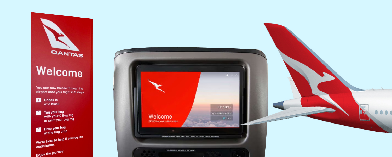
Qantas, a powerful brand supported by vibrant and dramatic visuals. No doubt, airlines have a big challenge to sell the destination through the use of their services. In comparison to Unyoked, the visual approach taken by Qantas is quite dramatic. The use of high-contrast imagery, high levels of momentum and movement, as well as emphasising scale are commonly applied. The brand's colours are heavily featured throughout all visuals, creating a consistent and recognisable theme even if the logos were removed. This approach to visuals not only applies to their marketing but extends to their sales and in-flight experiences. Despite having strong competition (with some even using the same colours), Qantas have built and managed their brand recognition by employing carefully considered visuals to all aspects of their business. Without these visuals supporting the brand, the Qantas brand could suffer from lack of recognisability and struggle to entice customers against their competitors.
This refers to anything we can observe with our eyes that is provided by the brand. Typically these are background images, iconography, diagrams, stylistic text or even simple shapes. These visuals apply across both digital and physical mediums and typically support the main message or activity the brand is wanting to convey.
To increase your brand awareness, visuals are one of the most crucial elements that allow you to influence your customers. It also allows you to differentiate your brand from competitors, and in some cases you can employ visuals to leverage the success of other brands if that is part of your strategy.
It can be tough to determine where to start when it comes to building a brand's visuals or refining those of an existing brand. If you're looking to improve or create compelling photography, diagrams and other visual assets for your brand, feel free to reach out to see how we can take your brand to the next level through visual storytelling.